Whenever I have to write a custom widget for GTK, I usually try to avoid writing too much boilerplate by abusing the CSS system. But that shouldn't be the case. GTK4's snapshot API is actually really fun and easy to use and so are libadwaita's animation APIs; allowing you to draw complex visuals really fast.
#When is CSS a better choice?
GTK's CSS is very powerful and familiar to newcomers from web dev background. It cannot only do widget styling but it also supports complex child selectors, animations, CSS variables, some pseudo classes (hover, focus etc), gradients, images and theme hot reloading between light, dark and high contrast modes.
Most of these (not everything) can be done without CSS but it's usually much more verbose and requires more effort. For example, something as simple as the :hover pseudo class, requires you to listen to Gtk.Widget#state_flags_changed, get the current flags with Gtk.Widget#get_state_flags and then check if they include Gtk.StateFlags.PRELIGHT. Sometimes, CSS is the only way to style nested widgets of sealed classes.
One of the most important advantages of CSS in my opinion, apart from how powerful it is, is that it allows anyone to contribute. Designers don't need to be familiar with the codebase or even how to compile the app, they can just try their CSS changes in the GTK Inspector. Newcomers don't need to learn the snapshot API.
Additionally, it improves maintainability somewhat as CSS variables can be controlled by the platform (libadwaita) and will follow future design changes automatically.
With that said, let's get started on custom widgets and snapshotting!
#Double progress bar with animations
We are going to build a progress bar similar to Gtk.ProgressBar but with two stacked bars. The first step to writing custom widgets is planning:
#API
The API will be much more limited than Gtk.ProgressBar. We only need to display the two bars without any extra features like pulsing, text, steps etc. So the API should just be two float (double) properties one named primary and one named secondary that represent the bars and accept values of 0.0 to 1.0. Vala
Vala
public class DoubleProgress : Gtk.Widget, Gtk.Accessible {
    private double _primary = 0;
    public double primary {
        get { return _primary; }
        set {
            var new_value = value.clamp (0.0, 1.0);
            // only update the value and notify
            // that it changed, when it actually
            // did. This way we will avoid drawing
            // for no reason.
            if (_primary != new_value) {
                _primary = new_value;
                this.notify_property ("primary");
            }
        }
    }

    private double _secondary = 0;
    public double secondary {
        get { return _secondary; }
        set {
            var new_value = value.clamp (0.0, 1.0);
            if (_secondary != new_value) {
                _secondary = new_value;
                this.notify_property ("secondary");
            }
        }
    }
}
#Drawing
Drawing works by overriding the widget's snapshot function. With Gtk.Snapshot you can programmatically draw shapes, stoke, apply blur, fading, draw bitmaps, cairo, rotate, transform and a lot more. Think of it as using a basic image manipulation and vector drawing program. You can use layers, draw shapes, import images, apply effects etc.
Let's break our widget down into shapes. We want a rectangle with one color drawn on top of another rectangle with another color. Each rectangle's width will be equal to the widget's multiplied by their progress property. We also need to make their corners rounded so they better match our design.Vala
public override void snapshot (Gtk.Snapshot snapshot) {
    // let's get the widget's dimensions
    int width = this.get_width ();
    int height = this.get_height ();

    // We want to draw the secondary behind
    // the primary, so we need to draw it first
    Graphene.Rect secondary_bar = Graphene.Rect () {
        // start location
        // we want it to start at the top left
        // so it's 0,0
        origin = Graphene.Point () {
            x = 0.0f,
            y = 0.0f
        },
        // rectangle size
        // height should fill the widget
        // width should equal to the widget's
        // multiplied by the progress
        size = Graphene.Size () {
            height = (float) height,
            width = (float) width * (float) this.secondary
        }
    };

    // same thing for the primary one
    Graphene.Rect primary_bar = Graphene.Rect () {
        origin = Graphene.Point () {
            x = 0.0f,
            y = 0.0f
        },
        size = Graphene.Size () {
            height = (float) height,
            width = (float) width * (float) this.primary
        }
    };

    // corners for rounding
    Graphene.Size non_rounded_corner = Graphene.Size () {
        height = 0f,
        width = 0f
    };

    Graphene.Size rounded_corner = Graphene.Size () {
        height = 9999f,
        width = 9999f
    };

    // let's push a rounded clip of the secondary_bar
    // where the right corners are rounded
    // think of this as making a layer or a mask
    snapshot.push_rounded_clip (Gsk.RoundedRect ().init (secondary_bar, non_rounded_corner, rounded_corner, rounded_corner, non_rounded_corner));

    // append the secondary layer, colored Red
    snapshot.append_color (Gdk.RGBA () {
        red = 1.0f,
        green = 0.0f,
        blue = 0.0f,
        alpha = 1.0f
    }, secondary_bar);

    // now let's 'exit' or 'close' the rounded layer
    snapshot.pop ();

    // same for the primary
    snapshot.push_rounded_clip (Gsk.RoundedRect ().init (primary_bar, non_rounded_corner, rounded_corner, rounded_corner, non_rounded_corner));
    snapshot.append_color (Gdk.RGBA () {
        red = 0.0f,
        green = 1.0f,
        blue = 0.0f,
        alpha = 1.0f
    }, primary_bar);
    snapshot.pop ();

    base.snapshot (snapshot);
}
It should now look like this:
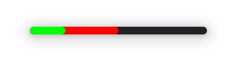
Let's optimize it now. We have some static values and we know that we don't have to draw the secondary bar at all if its progress is less than the primary's as it will be hidden behind it:Vala
Graphene.Point point = Graphene.Point () {
    x = 0.0f,
    y = 0.0f
};

Graphene.Size non_rounded_corner = Graphene.Size () {
    height = 0f,
    width = 0f
};

Graphene.Size rounded_corner = Graphene.Size () {
    height = 9999f,
    width = 9999f
};

Gdk.RGBA secondary_color = Gdk.RGBA () {
    red = 1.0f,
    green = 0.0f,
    blue = 0.0f,
    alpha = 1.0f
};

Gdk.RGBA primary_color = Gdk.RGBA () {
    red = 0.0f,
    green = 1.0f,
    blue = 0.0f,
    alpha = 1.0f
};

public override void snapshot (Gtk.Snapshot snapshot) {
    int width = this.get_width ();
    int height = this.get_height ();

    if (secondary > primary) {
        Graphene.Rect secondary_bar = Graphene.Rect () {
            origin = point,
            size = Graphene.Size () {
                height = (float) height,
                width = (float) width * (float) this.secondary
            }
        };

        snapshot.push_rounded_clip (Gsk.RoundedRect ().init (secondary_bar, non_rounded_corner, rounded_corner, rounded_corner, non_rounded_corner));
        snapshot.append_color (secondary_color, secondary_bar);
        snapshot.pop ();
    }

    Graphene.Rect primary_bar = Graphene.Rect () {
        origin = point,
        size = Graphene.Size () {
            height = (float) height,
            width = (float) width * (float) this.primary
        }
    };

    snapshot.push_rounded_clip (Gsk.RoundedRect ().init (primary_bar, non_rounded_corner, rounded_corner, rounded_corner, non_rounded_corner));
    snapshot.append_color (primary_color, primary_bar);
    snapshot.pop ();

    base.snapshot (snapshot);
}
Last but not least, we have to update the properties so they re-draw when they change:Vala
private double _primary = 0;
public double primary {
    get { return _primary; }
    set {
        new_value = value.clamp (0.0, 1.0);
        if (_primary != new_value) {
            _primary = new_value;
            this.notify_property ("primary");
            this.queue_draw ();
        }
    }
}

private double _secondary = 0;
public double secondary {
    get { return _secondary; }
    set {
        new_value = value.clamp (0.0, 1.0);
        if (_secondary != new_value) {
            _secondary = new_value;
            this.notify_property ("secondary");
            this.queue_draw ();
        }
    }
}
#Accent color
We can't exactly access CSS variables easily and listen to changes from outside CSS, so we are going to use libadwaita's style manager and listen to changes to its accent-color property. We are also going to replace the local variable primary_color with a property, so we re-draw the widget when the color changes:Vala
// Default blue accent color
private Gdk.RGBA _primary_color = {
    120 / 255.0f,
    174 / 255.0f,
    237 / 255.0f,
    1f
};
private Gdk.RGBA primary_color {
    get { return _primary_color; }
    set {
        if (value != _primary_color) {
            _primary_color = value;
            // redraw the widget
            this.queue_draw ();
        }
    }
}

construct {
    var default_sm = Adw.StyleManager.get_default ();
    // if it supports accent colors
    if (default_sm.system_supports_accent_colors) {
        // listen to accent color changes
        default_sm.notify["accent-color-rgba"].connect (update_accent_color);
        // and update the private variable initially
        // so it doesn't call queue_draw for no reason yet
        _primary_color = default_sm.get_accent_color_rgba ();
    }
}

private void update_accent_color () {
    primary_color = Adw.StyleManager.get_default ().get_accent_color_rgba ();
}
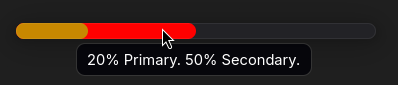
#Accessibility
This is a tricky one. At first thought, this should have the progress-bar ARIA ROLE, but it can't really be described by that. The progress-bar role can only announce one value. Considering it's used for presentation only, the role of the same name could do along with a label describing its values but for the sake of this example let's treat it as a label. We will introduce two additional properties, primary_title and secondary_title, used exclusively for the tooltips / aria label. We also need to update the aria label every time the progress does as well:Vala
 private double _primary = 0;
 public double primary {
     get { return _primary; }
     set {
         var new_value = value.clamp (0.0, 1.0);
         if (_primary != new_value) {
            _primary = new_value;
             this.notify_property ("primary");
             this.queue_draw ();
         }

        update_aria ();
    }
}

private double _secondary = 0;
public double secondary {
    get { return _secondary; }
    set {
        var new_value = value.clamp (0.0, 1.0);
        if (_secondary != new_value) {
            _secondary = new_value;
            this.notify_property ("secondary");
            this.queue_draw ();
        }

        update_aria ();
    }
}

private string _primary_title = _("Primary");
public string primary_title {
    get { return _primary_title; }
    set {
        if (value != _primary_title) {
            _primary_title = value;
            update_aria ();
        }
    }
}

private string _secondary_title = _("Secondary");
public string secondary_title {
    get { return _secondary_title; }
    set {
        if (value != _secondary_title) {
            _secondary_title = value;
            update_aria ();
        }
    }
}

private void update_aria () {
    // double => percent
    string aria_string = _("%d%% %s. %d%% %s.").printf (
        ((int) (this.primary * 100)).clamp (0, 100),
        primary_title,
        ((int) (this.secondary * 100)).clamp (0, 100),
        secondary_title
    );

    this.tooltip_text = aria_string;
    this.update_property (Gtk.AccessibleProperty.LABEL, aria_string, -1);
}

static construct {
    set_accessible_role (Gtk.AccessibleRole.LABEL);
}

construct {
    var default_sm = Adw.StyleManager.get_default ();
    if (default_sm.system_supports_accent_colors) {
        default_sm.notify["accent-color-rgba"].connect (update_accent_color);
        _primary_color = default_sm.get_accent_color_rgba ();
    }

    // update it initially so it gets set
    update_aria ();
}
#Animation
We want an ease-in-out animation when either of the progress bar changes. For that we are going to use Adw.TimedAnimation. The API is similar to our progress properties, so we are going to replace them with the animation's internally. We are also going to use two different Adw.TimedAnimation, one for each bar, since they are not synced.Vala
// animation duration in ms
const uint ANIMATION_DURATION = 500;
Adw.TimedAnimation secondary_animation;
Adw.TimedAnimation primary_animation;

private double _primary = 0;
public double primary {
    get { return _primary; }
    set {
        var new_value = value.clamp (0.0, 1.0);
        if (_primary != new_value) {
            this.notify_property ("primary");

            // The animation starts from the _primary value
            // and stops at the new_value
            primary_animation.value_from = _primary;
            primary_animation.value_to = new_value;
            primary_animation.play ();

            // we no longer need to queue_draw here
            // as the animation callback will do so
            _primary = value;
        }

        update_aria ();
    }
}

private double _secondary = 0;
public double secondary {
    get { return _secondary; }
    set {
        var new_value = value.clamp (0.0, 1.0);
        if (_secondary != new_value) {
            this.notify_property ("secondary");

            secondary_animation.value_from = _secondary;
            secondary_animation.value_to = new_value;
            secondary_animation.play ();

            _secondary = new_value;
        }

        update_aria ();
    }
}

// This is what gets animated.
// Since we draw the animation, we only need to
// call queue_draw
private void primary_animation_target_cb (double value) {
    this.queue_draw ();
}

// Optimization by redrawing for the secondary
// bar animation, only when the secondary bar changes,
// we skip re-drawing the primary one for no reason
private void secondary_animation_target_cb (double value) {
    if (this.secondary_animation.value > this.primary_animation.value) return;
    this.queue_draw ();
}

construct {
    var default_sm = Adw.StyleManager.get_default ();
    if (default_sm.system_supports_accent_colors) {
        default_sm.notify["accent-color-rgba"].connect (update_accent_color);
        _primary_color = default_sm.get_accent_color_rgba ();
    }

    // Animations will range from 0.0 to 1.0, matching our progress bars'
    // values.
    var target = new Adw.CallbackAnimationTarget (secondary_animation_target_cb);
    secondary_animation = new Adw.TimedAnimation (this, 0.0, 1.0, ANIMATION_DURATION, target) {
        easing = Adw.Easing.EASE_IN_OUT_QUART
    };

    var target_primary = new Adw.CallbackAnimationTarget (primary_animation_target_cb);
    primary_animation = new Adw.TimedAnimation (this, 0.0, 1.0, ANIMATION_DURATION, target_primary) {
        easing = Adw.Easing.EASE_IN_OUT_QUART
    };

    update_aria ();
}

public override void snapshot (Gtk.Snapshot snapshot) {
    int width = this.get_width ();
    int height = this.get_height ();

    // same as before, but this time we are going to use the
    // animation values instead of our properties
    if (this.secondary_animation.value > this.primary_animation.value) {
        Graphene.Rect secondary_bar = Graphene.Rect () {
            origin = point,
            size = Graphene.Size () {
                height = (float) height,
                width = (float) width * (float) this.secondary_animation.value
            }
        };

        snapshot.push_rounded_clip (Gsk.RoundedRect ().init (secondary_bar, non_rounded_corner, rounded_corner, rounded_corner, non_rounded_corner));
        snapshot.append_color (secondary_color, secondary_bar);
        snapshot.pop ();
    }

    Graphene.Rect primary_bar = Graphene.Rect () {
        origin = point,
        size = Graphene.Size () {
            height = (float) height,
            // here too
            width = (float) width * (float) this.primary_animation.value
        }
    };

    snapshot.push_rounded_clip (Gsk.RoundedRect ().init (primary_bar, non_rounded_corner, rounded_corner, rounded_corner, non_rounded_corner));
    snapshot.append_color (primary_color, primary_bar);
    snapshot.pop ();

    base.snapshot (snapshot);
}
#Closing Notes
With the above, we went from 0 to a custom animated accessible widget that follows the system accent colors. This wasn't meant to be a step-by-step guide and assumes some knowledge but it's aimed for people who already have some experience with GTK and are getting into the snapshot API.
Here's the full code:Vala
public class DoubleProgress : Gtk.Widget, Gtk.Accessible {
    const uint ANIMATION_DURATION = 500;
    Adw.TimedAnimation secondary_animation;
    Adw.TimedAnimation primary_animation;

    private double _primary = 0;
    public double primary {
        get { return _primary; }
        set {
            var new_value = value.clamp (0.0, 1.0);
            if (_primary != new_value) {
                this.notify_property ("primary");

                primary_animation.value_from = _primary;
                primary_animation.value_to = new_value;
                primary_animation.play ();

                _primary = value;
            }

            update_aria ();
        }
    }

    private double _secondary = 0;
    public double secondary {
        get { return _secondary; }
        set {
            var new_value = value.clamp (0.0, 1.0);
            if (_secondary != new_value) {
                this.notify_property ("secondary");

                secondary_animation.value_from = _secondary;
                secondary_animation.value_to = new_value;
                secondary_animation.play ();

                _secondary = new_value;
            }

            update_aria ();
        }
    }

    private Gdk.RGBA _primary_color = {
        120 / 255.0f,
        174 / 255.0f,
        237 / 255.0f,
        1f
    };
    private Gdk.RGBA primary_color {
        get { return _primary_color; }
        set {
            if (value != _primary_color) {
                _primary_color = value;
                this.queue_draw ();
            }
        }
    }

    private string _primary_title = "Primary";
    public string primary_title {
        get { return _primary_title; }
        set {
            if (value != _primary_title) {
                _primary_title = value;
                update_aria ();
            }
        }
    }

    private string _secondary_title = "Secondary";
    public string secondary_title {
        get { return _secondary_title; }
        set {
            if (value != _secondary_title) {
                _secondary_title = value;
                update_aria ();
            }
        }
    }

    private void update_aria () {
        string aria_string = "%d%% %s. %d%% %s.".printf (
            ((int) (this.primary * 100)).clamp (0, 100),
            primary_title,
            ((int) (this.secondary * 100)).clamp (0, 100),
            secondary_title
        );

        this.tooltip_text = aria_string;
        this.update_property (Gtk.AccessibleProperty.LABEL, aria_string, -1);
    }

    static construct {
        set_accessible_role (Gtk.AccessibleRole.LABEL);
    }

    private void primary_animation_target_cb (double value) {
        this.queue_draw ();
    }

    private void secondary_animation_target_cb (double value) {
        if (this.secondary_animation.value > this.primary_animation.value) return;
        this.queue_draw ();
    }

    construct {
        var default_sm = Adw.StyleManager.get_default ();
        if (default_sm.system_supports_accent_colors) {
            default_sm.notify["accent-color-rgba"].connect (update_accent_color);
            _primary_color = default_sm.get_accent_color_rgba ();
        }

        var target = new Adw.CallbackAnimationTarget (secondary_animation_target_cb);
        secondary_animation = new Adw.TimedAnimation (this, 0.0, 1.0, ANIMATION_DURATION, target) {
            easing = Adw.Easing.EASE_IN_OUT_QUART
        };

        var target_primary = new Adw.CallbackAnimationTarget (primary_animation_target_cb);
        primary_animation = new Adw.TimedAnimation (this, 0.0, 1.0, ANIMATION_DURATION, target_primary) {
            easing = Adw.Easing.EASE_IN_OUT_QUART
        };

        update_aria ();
    }

    private void update_accent_color () {
        primary_color = Adw.StyleManager.get_default ().get_accent_color_rgba ();
    }

    Graphene.Point point = Graphene.Point () {
        x = 0.0f,
        y = 0.0f
    };

    Graphene.Size non_rounded_corner = Graphene.Size () {
        height = 0f,
        width = 0f
    };

    Graphene.Size rounded_corner = Graphene.Size () {
        height = 9999f,
        width = 9999f
    };

    Gdk.RGBA secondary_color = Gdk.RGBA () {
        red = 1.0f,
        green = 0.0f,
        blue = 0.0f,
        alpha = 1.0f
    };

    public override void snapshot (Gtk.Snapshot snapshot) {
        int width = this.get_width ();
        int height = this.get_height ();

        if (this.secondary_animation.value > this.primary_animation.value) {
            Graphene.Rect secondary_bar = Graphene.Rect () {
                origin = point,
                size = Graphene.Size () {
                    height = (float) height,
                    width = (float) width * (float) this.secondary_animation.value
                }
            };

            snapshot.push_rounded_clip (Gsk.RoundedRect ().init (secondary_bar, non_rounded_corner, rounded_corner, rounded_corner, non_rounded_corner));
            snapshot.append_color (secondary_color, secondary_bar);
            snapshot.pop ();
        }

        Graphene.Rect primary_bar = Graphene.Rect () {
            origin = point,
            size = Graphene.Size () {
                height = (float) height,
                width = (float) width * (float) this.primary_animation.value
            }
        };

        snapshot.push_rounded_clip (Gsk.RoundedRect ().init (primary_bar, non_rounded_corner, rounded_corner, rounded_corner, non_rounded_corner));
        snapshot.append_color (primary_color, primary_bar);
        snapshot.pop ();

        base.snapshot (snapshot);
    }
}